Pantone & Spot Colors
Naming Spot Colors
For spot color jobs, use PANTONE PMS colors only. Avoid spot color names like “Red” or “Color 1” and “Color 2.” Using the actual PANTONE color name will help us identify the ink color you wish to use.
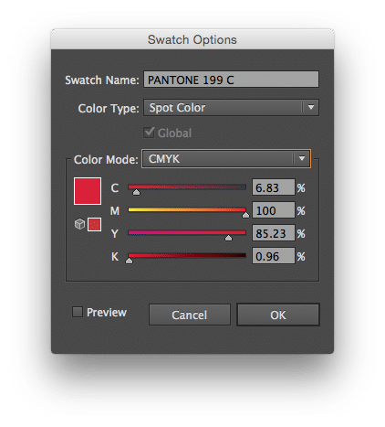
*PANTONE 199 C tells us you want to use Pantone’s PMS 199 ink on Coated paper.
CMYK and/or RGB Colors or Images used in Spot Color Jobs
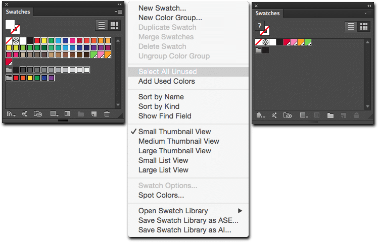
You cannot use CMYK or RGB images, or elements, in spot color jobs. They separate into multiple colors that have nothing to do with the PMS inks intended for your printout. Clear your palette of anything but Black and your chosen Pantone colors, and use only monotones, duotones or tritones with PMS colors.
Avoid Duplicate PMS Names
Stick to one PANTONE palette to choose your spot colors from. Switching between different PANTONE palettes (Coated, Uncoated, etc.) can result in multiple PANTONE names being used for the same color. When we get your file, plates will be made according to each color used in your file. Using the same color with multiple names can result in the output of extra plates. *Example: PMS 300 C and PMS 300 U are the same color, but they are used on different types of paper (C = Coated, U = Uncoated). Using both of these in the same file will generate two different plat
OVERPRINT ISSUES
The most common problem we encounter with overprinting is white type set to overprint on color backgrounds.
It basically disappears. The same effect can be seen by applying the Multiply effect to white type over a color background.
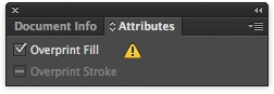
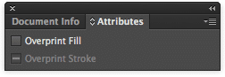
*Check your Attributes window to make sure the Fill or Stroke is NOT set to overprint
• Select your white text
• Go to Window > Attributes
• Check to make sure the box labeled “Overprint” is NOT checked