Rich Black vs. 100% Black

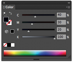
RICH BLACK (40,30,20,100)
Rich black should be used to create rich looking backgrounds, large black accent areas and large headline type. Our recommended mix for rich black is 40% Cyan, 30% Magenta, 20% Yellow and 100% Black (40,30,20,100). Use this to avoid excess ink coverage and associated problems. *Best Practice is to avoid using Rich Black for small type
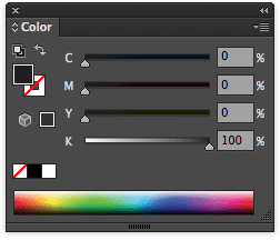
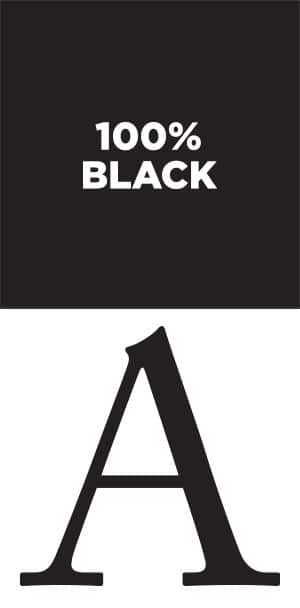
100% BLACK (0,0,0,100)
Small, multi-color type can be difficult to register over a large sheet on the press, and may even present a color halo effect. We recommend setting small type in 100% Black, especially in Photoshop.